
In today’s digital age, having a mobile-first design for your website is crucial, especially for food businesses. With most customers using their smartphones to place online orders, a responsive website can significantly enhance the user experience and boost sales. Let’s explore how to design a mobile-first website tailored for online food orders and why it’s essential for your business.
What is Mobile-First Design?

Mobile-first design is an approach where the website is designed primarily for mobile devices, ensuring it performs seamlessly on smaller screens before scaling up for desktops. This strategy is particularly vital for food businesses, as customers frequently use their phones to browse menus, place orders, and make payments.
Benefits of a Mobile-First Website for Online Food Orders
- Enhanced User Experience: Ensures customers can easily navigate your website on their mobile devices.
- Higher Conversion Rates: A user-friendly design encourages more online orders.
- Improved SEO Rankings: Search engines like Google prioritize mobile-friendly websites.
- Increased Customer Engagement: Engaging features keep customers coming back.
Steps to Design a Mobile-First Website for Food Orders
1. Prioritize Simple Navigation
Make it easy for users to find what they need with:
- Clear Menus: Organize your food categories logically.
- Search Functionality: Allow users to quickly search for specific dishes or items.
- Sticky Navigation Bar: Keep essential links like the menu and cart accessible at all times.
2. Optimize Loading Speed
A fast website is critical for retaining customers. To enhance loading speed:
- Compress images without compromising quality.
- Minimize the use of heavy scripts and plugins.
- Use a reliable hosting service for consistent performance.
3. Use Responsive Design
Ensure your website adapts to various screen sizes by:
- Testing layouts on different devices.
- Using flexible grids and scalable images.
- Incorporating touch-friendly buttons and controls.
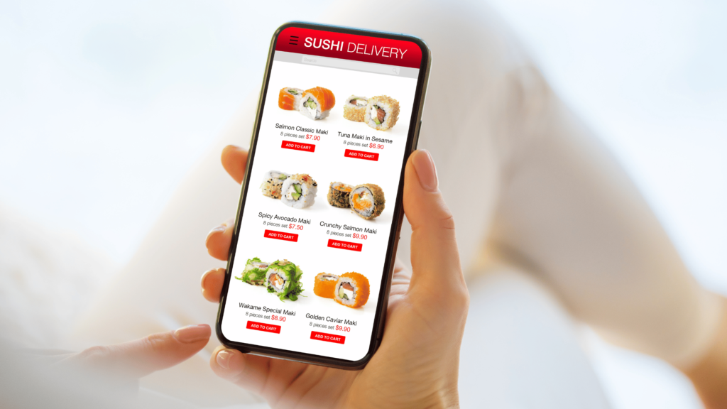
4. Highlight Online Ordering Features
Make the ordering process straightforward by:
- Adding a prominent “Order Now” button on the homepage.
- Displaying clear pricing and item descriptions.
- Allowing customers to customize their orders easily.
5. Simplify Checkout Process

A smooth checkout experience reduces cart abandonment. Tips include:
- Offering multiple payment options.
- Enabling guest checkout to avoid mandatory account creation.
- Auto-filling form fields where possible.
6. Integrate Mobile-Friendly Features
Enhance functionality with features like:
- Push Notifications: Notify users of discounts or order updates.
- Geolocation Services: Offer delivery tracking and local deals.
- Mobile Wallets: Accept payments via Apple Pay, Google Pay, or similar services.
7. Test and Iterate
Regularly test your website to identify and fix issues. Focus on:
- User feedback to improve design and functionality.
- Analytics to understand customer behavior and preferences.
- A/B testing to optimize layouts and features.
Common Challenges and Solutions
- Slow Loading Times: Use caching and content delivery networks (CDNs) to improve speed.
- Complex Navigation: Simplify menus and prioritize essential features for mobile users.
- Compatibility Issues: Test across multiple devices and browsers to ensure seamless performance.
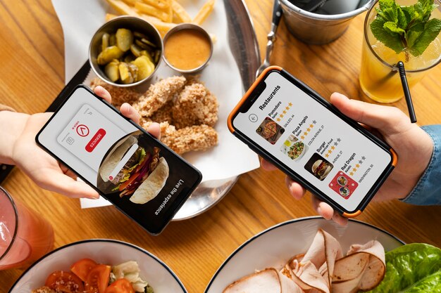
Examples of Effective Mobile-First Websites for Food Orders
- Domino’s Pizza: Features an intuitive interface with a quick order tracker and easy customization options.
- Uber Eats: Provides seamless navigation, real-time tracking, and personalized recommendations.
- Local Cafes: Many small businesses use mobile-first platforms to streamline ordering and enhance customer engagement.
Conclusion
A mobile-first website is no longer optional for food businesses—it’s a necessity. By focusing on responsive design, user-friendly navigation, and streamlined ordering processes, you can create a website that not only meets customer expectations but also drives sales. Start optimizing your site today to stay ahead in the competitive online food industry.
Q1: What is the difference between mobile-friendly and mobile-first design?
Mobile-friendly designs adapt to mobile devices, while mobile-first designs prioritize mobile users from the outset.
Q2: How can I make my website mobile-friendly?
Focus on responsive layouts, fast loading times, and touch-friendly features.
Q3: Why is a mobile-first website important for food businesses?
Most customers use mobile devices to place online orders, making a mobile-first design essential for user experience and conversions.
Q4: How often should I update my mobile-first website?
Regular updates ensure your website remains functional, secure, and aligned with user expectations.
Q5: What tools can I use to test my website’s mobile performance?
Use tools like Google’s Mobile-Friendly Test, GTmetrix, and BrowserStack for performance analysis.